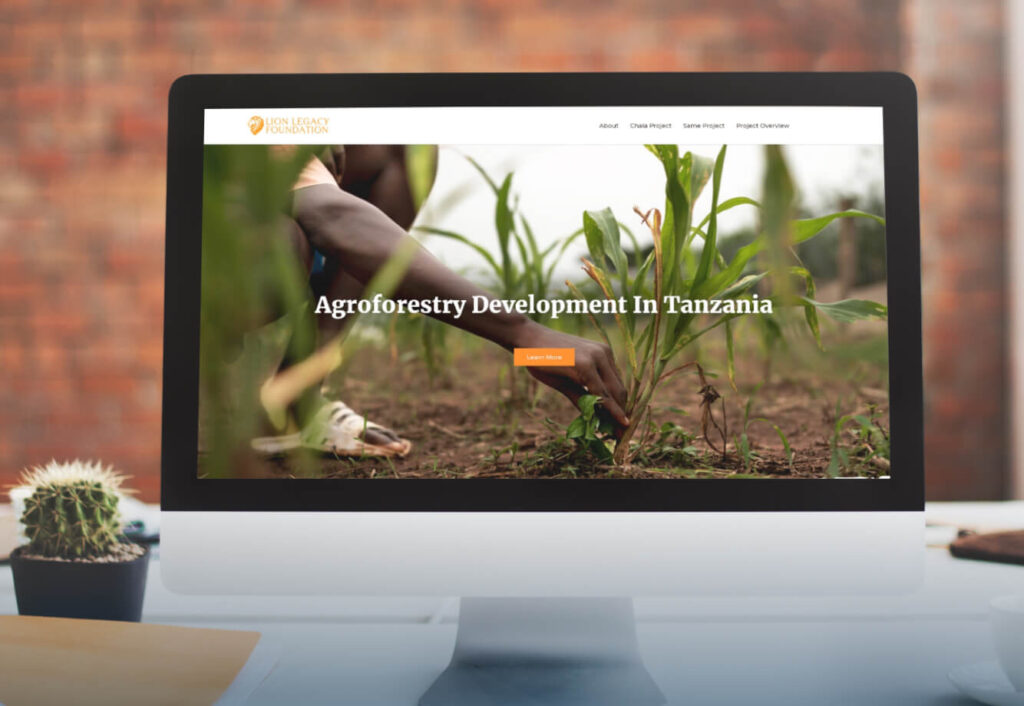
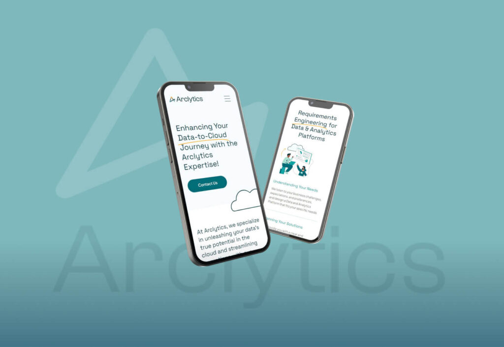
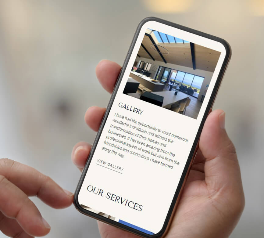
The website is developed with responsiveness as a top priority, ensuring it adjusts smoothly across desktop, laptop, tablet, and mobile devices. The layout is refined for each device type while maintaining the core design, providing an optimal user experience regardless of how visitors access the site.


